My last agile squad with Three was with the Customer Support team. Usually Support focuses on self support articles and links pegging to other relative pages. My job was to coordinate with the copy writer and organise content into a more UX visual appealing architectural design - which was one of my challenges. The other major challenge was to design on the guidelines of the company’s Digital Design System (DDS), which was used as a standard for site builders that operate on an AEM (Adobe Experience Manager) system. Anything beyond that system has to be hard coded then embeded within the DDS.
To make changes to the Design System, I had to a follow certain procedure:
Identify the problem with the current design.
Design a mockup mid fidelity UX sketch and propose changes that can improve the usability.
Once my design gets the red light, then it has to visualised through high fidelity (UI) and tested.
The design teams works with the site builders and Developers to build the code.
Now it is ready to use.
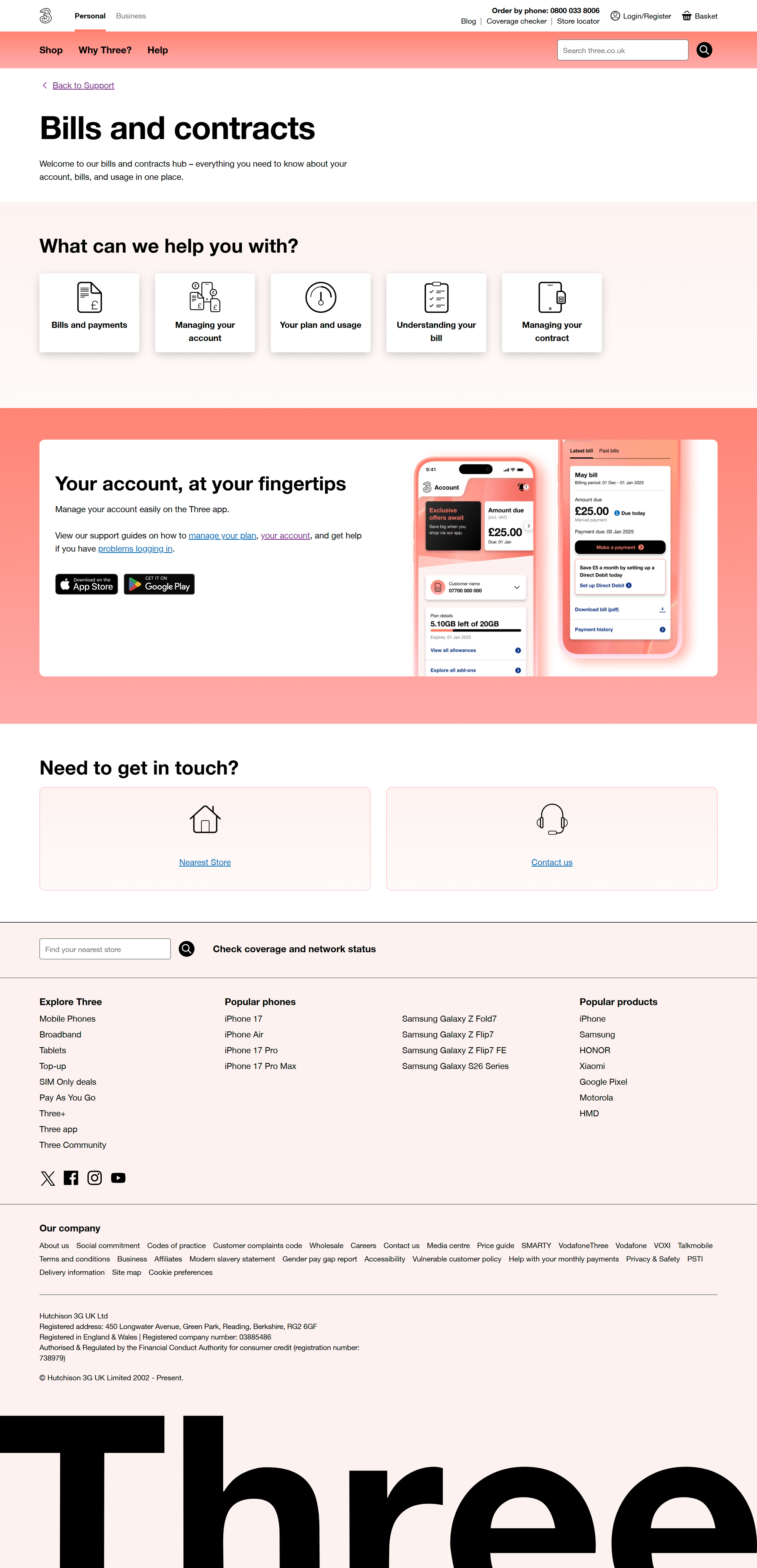
An example of my work was the Billing Support page.
The above design is from the live Billing support page and the one thing that I noticed is that lost of topic title that have several sub-topics embeded within them and that are opened in an accordion. Two Problems here:
The more topics we have, the longer the page gets. Not to mention when we the user switches to mobile view, the scroll down becomes more longer.
There are 5 topics. All are important to be viewed by the user. Non takes any prevalence over the other - so doesn't make sense to stack them over each other.
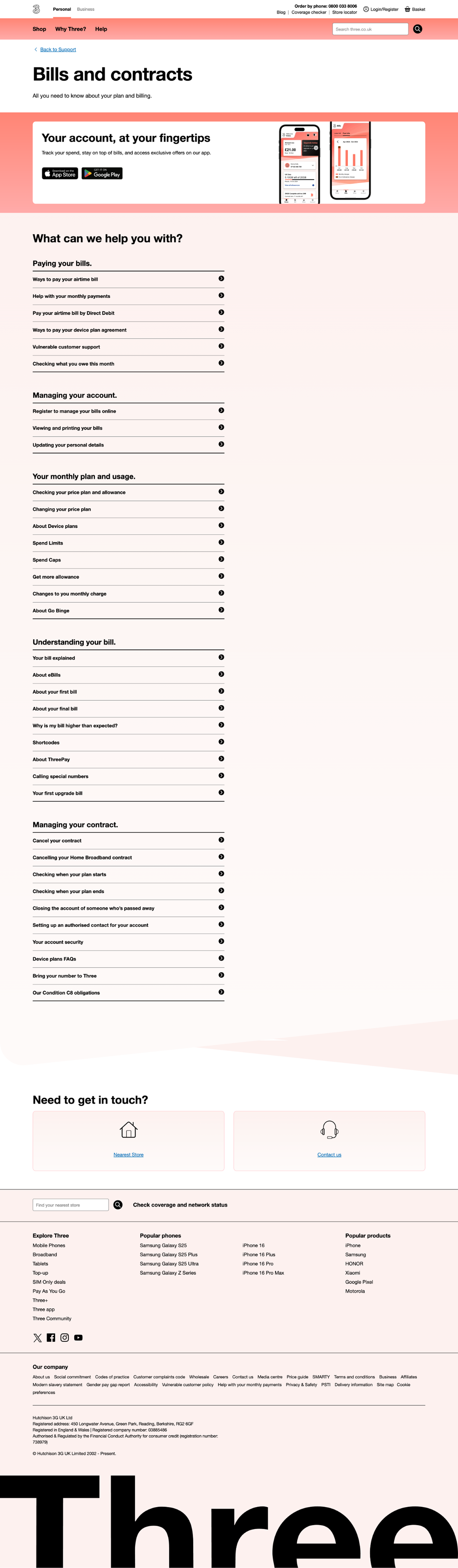
My suggestion:
I used a dynamic design solution that can stack all topics within the fold and become clickable to open the relevant sub-topics below. This design did require coding and user testing. Another god point about this dynamic design component is that it can be used across many pages. The code used can create a dynamic open/ close section that can can hide content and open upon request. That way it makes pages smaller, less copy and create a sense of gamification.
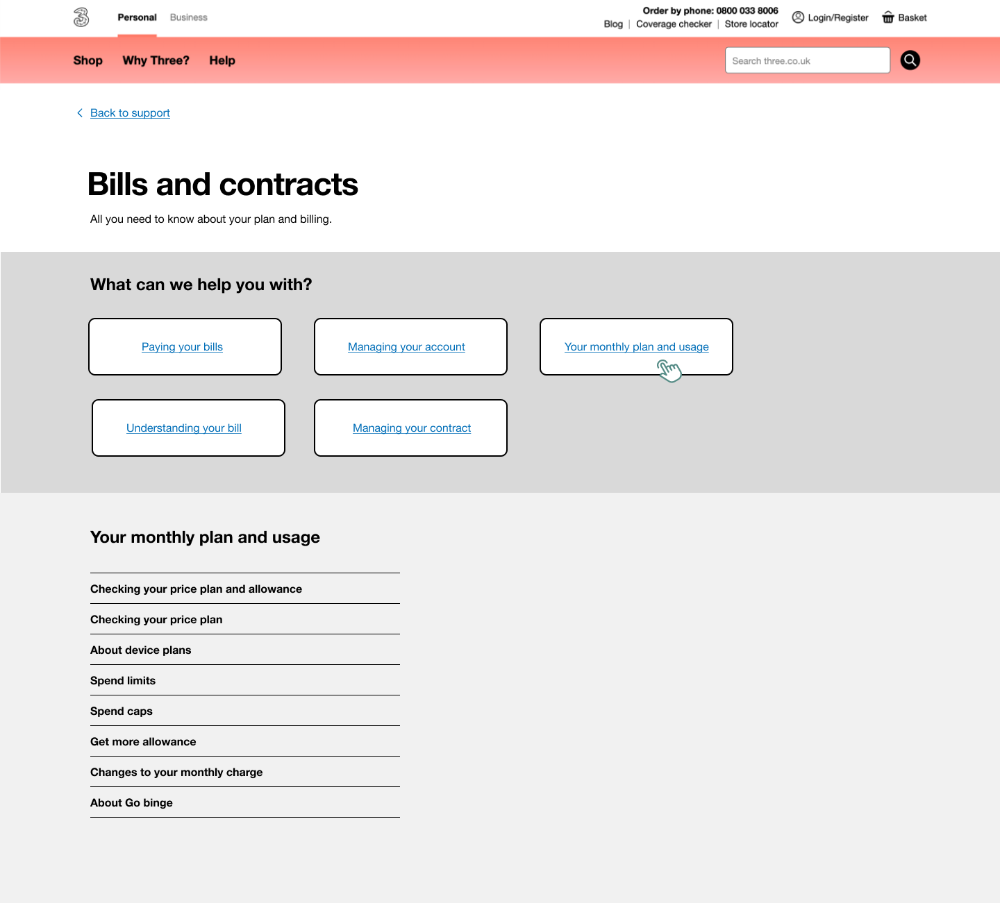
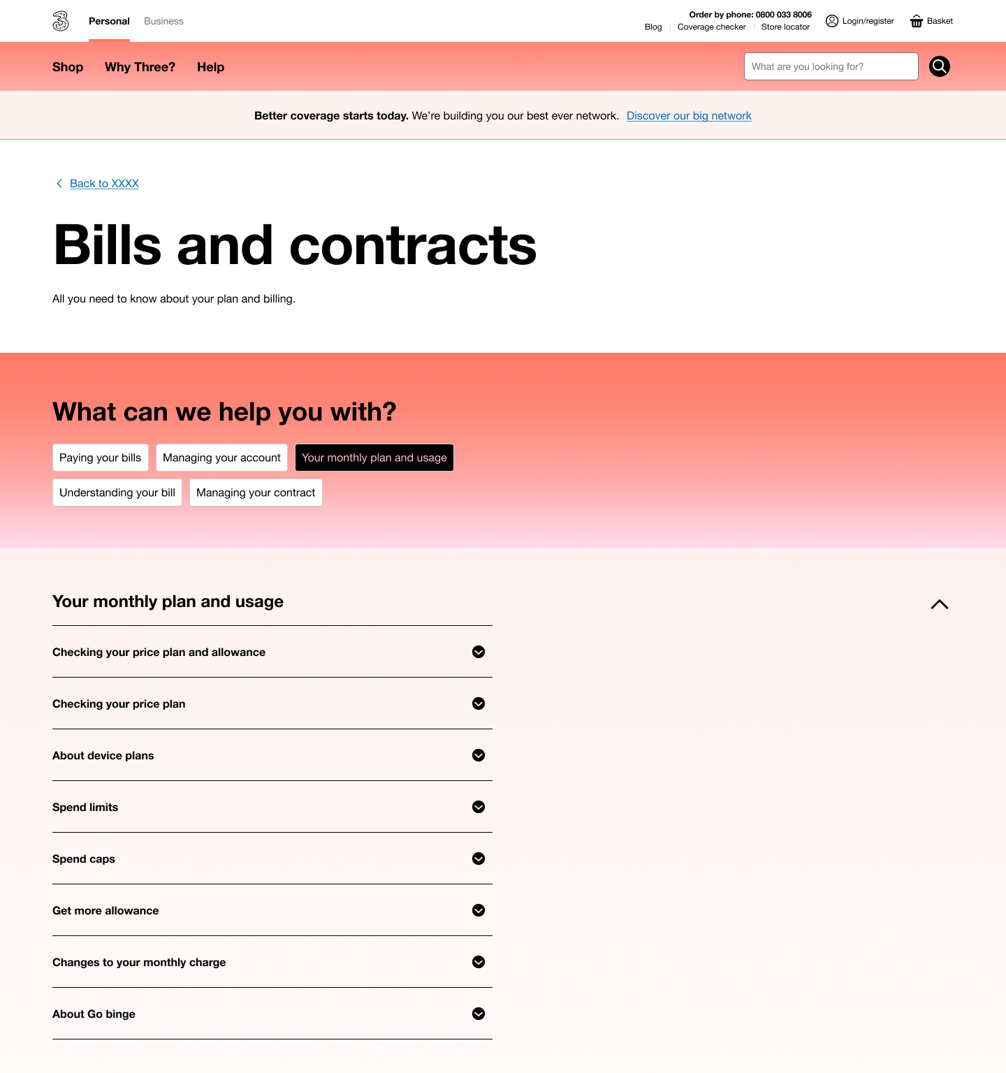
UI High Fidelity options:
Option 1 with stacked tabs.
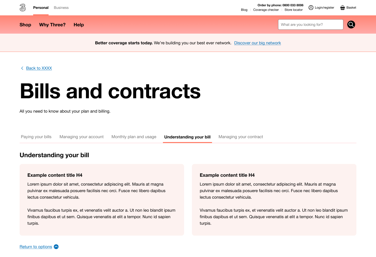
Option 2 was do with the brand and AEM compatible horizontal tabs.
Conclusion:
Due to the merging with Vodafone, business had to put a hold on any new design components unless it is something critical. My second best UX solution was to have the tabs stacked horizontal + use iconography and park the idea of a dynamic section opening on the same screen - but to have content displayed by a click on a second page, that open within the same window tab. This idea was agreed upon, built and went live.