With the merger process with Vodafone was in progress, the business was choosing the customers whether to stay or switch to Vodafone. This was part of a campaign that will migrate customers to the new business, though both companies, Three and Vodafone do run on the same network. An email will be sent out to all Three customers - it is an informative campaign email that highlights the progress that was being made to combine both networks for better coverage. A link in the email will open a new web page that will explain the benefits of joining Vodafone, the great un-locked deals that are awaiting and to address any concerns that my occur.
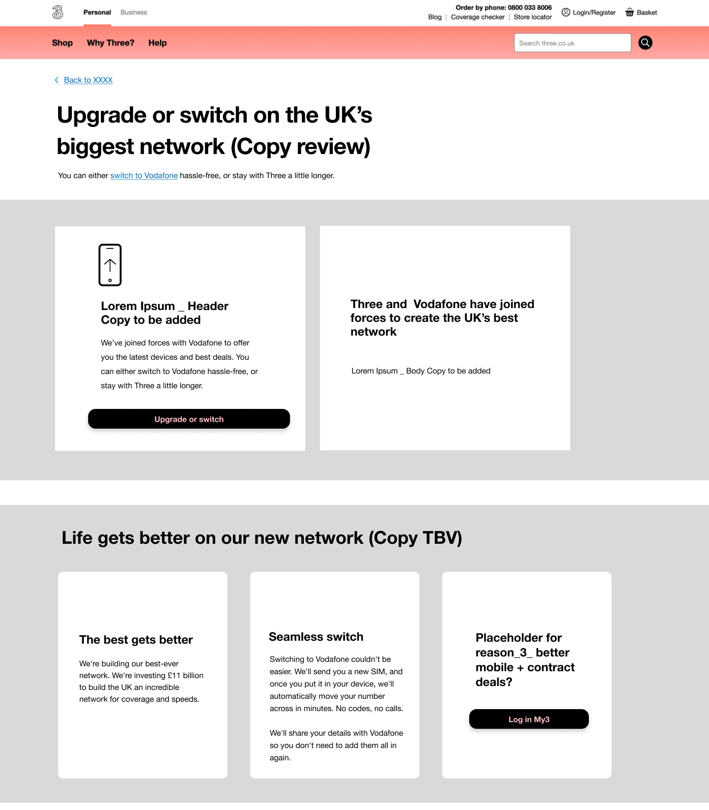
UX first draft design used a start point to highlight the initial requirements and to be used as a start point for future iterations. CTA’s request the user to log into there profile in My3 then go through the seamless process or can browse various deals, as well inside My3.
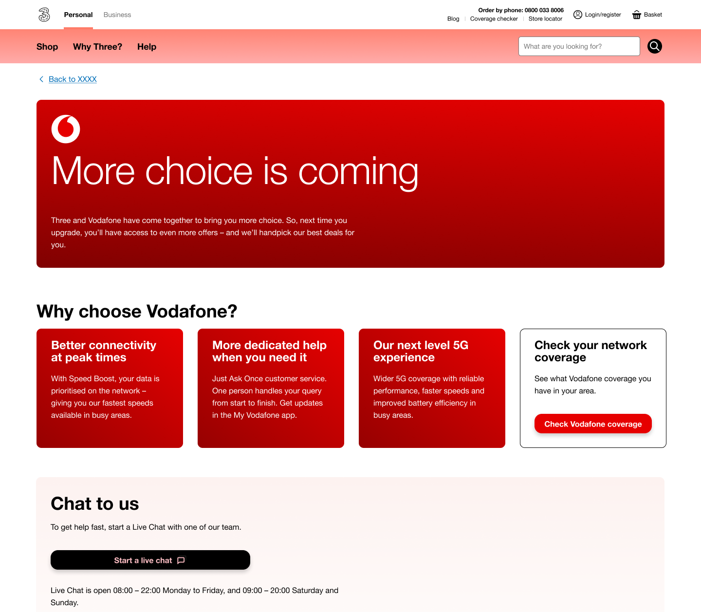
Business requirements were for not logging into My3, but to call the chat with customer support and they will do the network switch. The only CTA on the page was to link to the Vodafone network checker page. The UI was designed according to Vodafone’s colours and we used there brand design system assets - colour of the banner, tiles and the button.
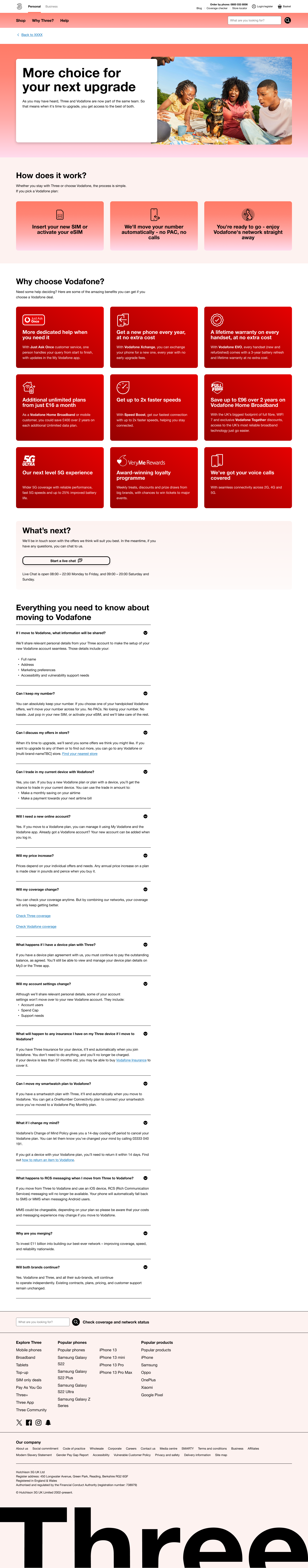
Second iteration was conducted in collaboration with the copy writer, whom received further content instructions from business. I also expanded the FAQ section and used Vodafone iconography for some visual presentation. Another major UI change was to Three’s assets for the first 2 sections of the page, as we thought this message is directed to Three’s customers then down the line, when scrolling down, we can highlight the benefits of joining Vodafone.