Whilst working in the customer support team, my approach was to deliver dynamic agile content with less copy and more visual engagement. I worked on many projects - ranging from Billing Support, Roaming Support, SIM support and many more. During 2025 our KPI target was improved - Our KPI’s were measured by the number of calls received by the call centre - the lower the better.
Below are some business data analytics to demonstrate how better dynamic UX can deliver better KPIs.
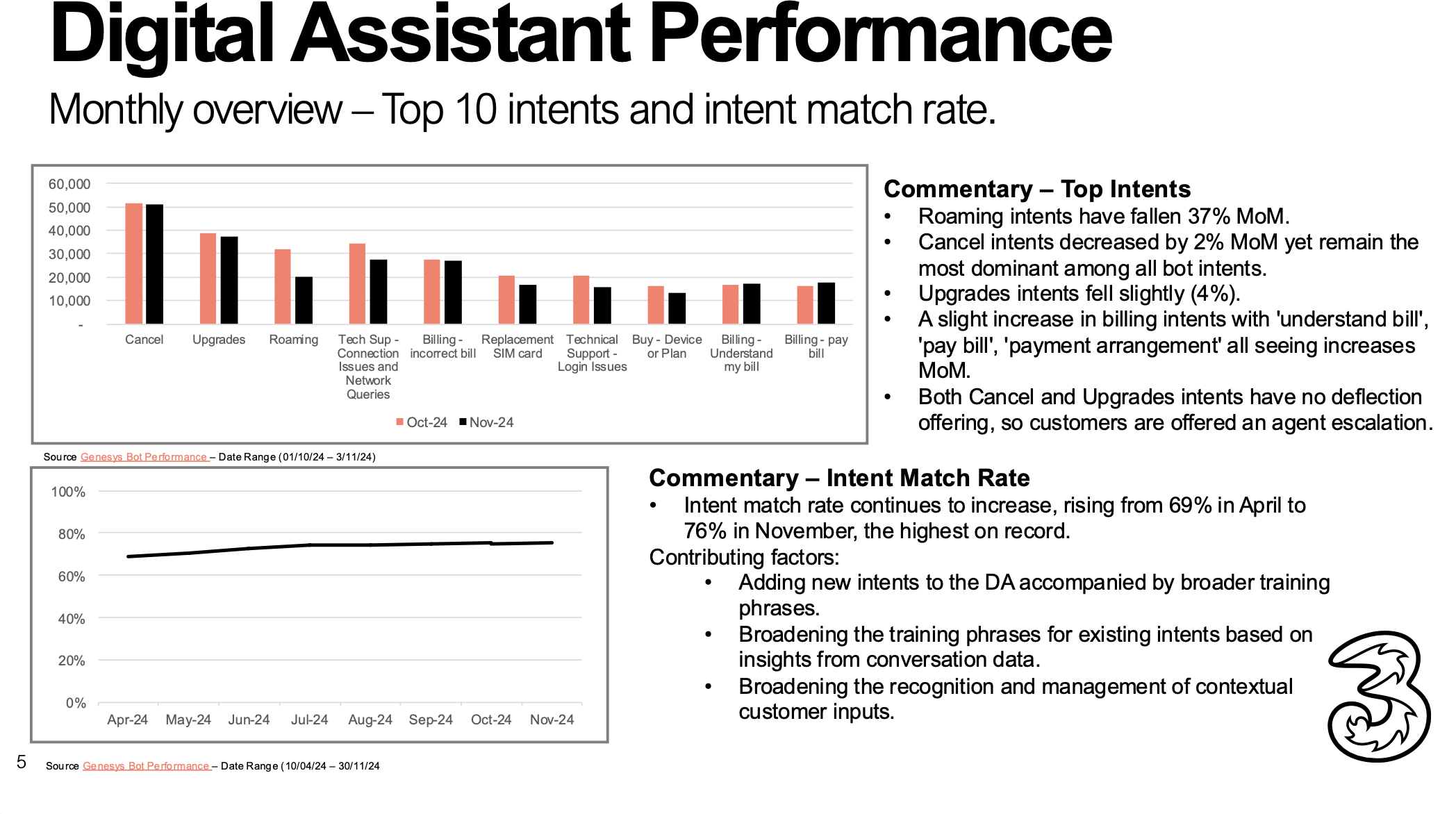
End of Year 2024 Business Data Analytics
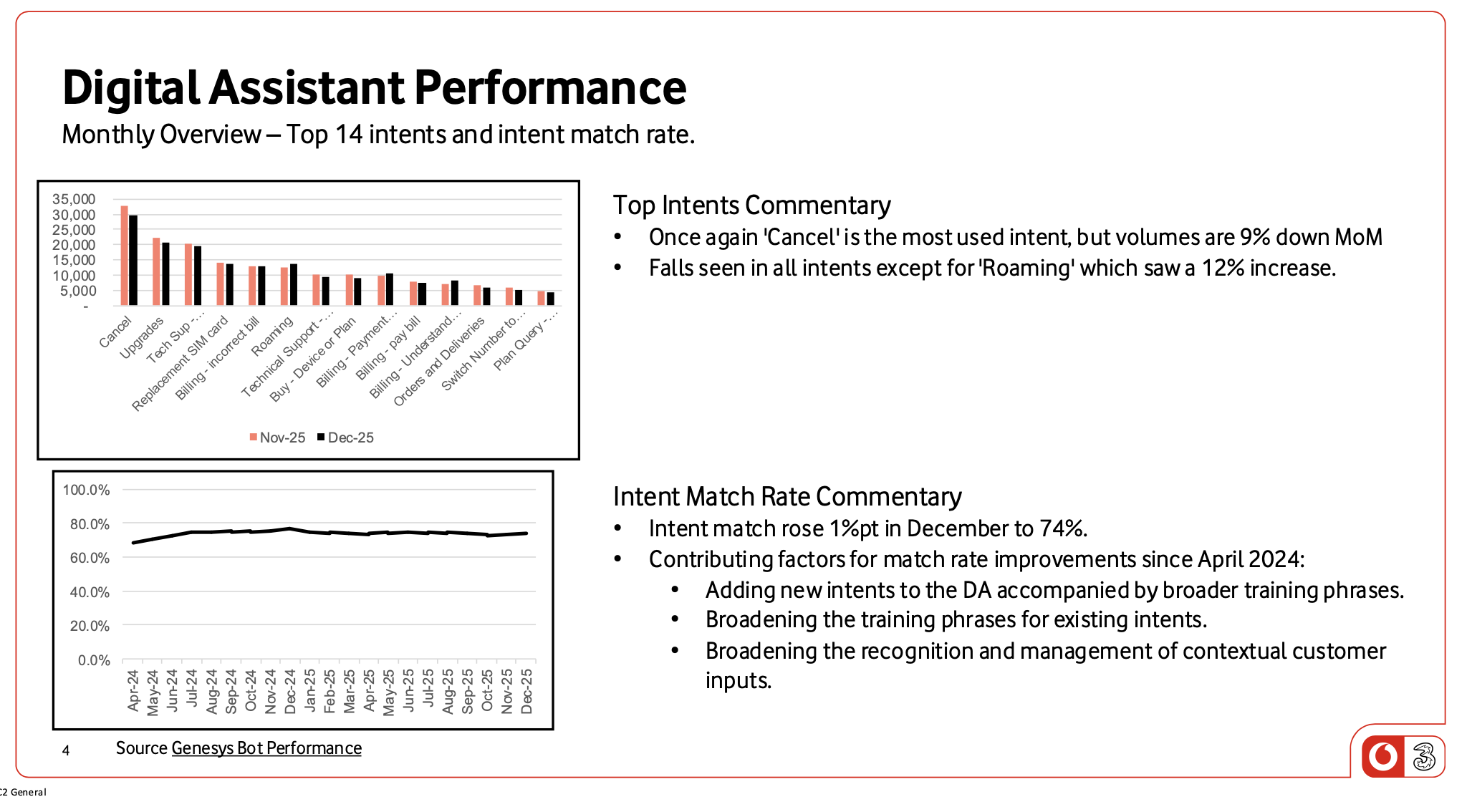
End of Year 2025 Business Data Analytics
Some conclusion insights:
During November 2024:
Cancelation calls received by the call centre was 50,000.
Various Billing and contract calls were around 28,000.
Roaming related calls were 20,000.
During December 2025:
Cancelation calls dropped to 30,000.
Billing issues discussed and went through the call centre ranged from 10,000 to 15,000.
Roaming calls dropped to 15,000.
Contact Us
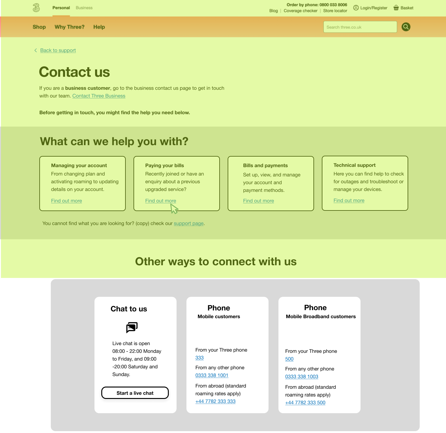
One of the favourite high profile projects I worked on was the ‘Contact Us’ page. The UX challenge I faced was the dilemma whether the preference was to prioritise self support over ‘calling us’. From a business point of view, self service results in less contact with customer support, but from a customer point of view, they want to get to the point and call someone to discuss there problem. What we had before (as shown below) an out of brand design that (again) contains lots of content and needs a hierarchy review.
After conducting a UX audit, I concluded that:
An urgent need to conduct a user test to understand user’s preferences in terms of UX service hierarchy - what comes first, self service or going straight to ‘calling us’. As we see in the above page, business decided to have self service first. That was something I wanted to confirm.
A need to work on the UX architectural design and to bring up the page with current UX UI branding.
Switch to B2B has to be on the top.
Too much hyper links and copy linked content.
First Draft UX design addressed my concerns and was designed after I concluded an AI driven User Test that showed user have a tendency to read relevant articles and try to solve there problems by themselves before picking up the phone or chatting with someone. But also I had a gut feeling that a great chunk of customers, especially the seniors, would prefer a human interface. That is why I re-designed the fold 2880px. x 1800px. to address most of the above issues. As shown below I used the UI guideline of 1440px. x 900px.
First draft UX - Fold 1440px. x 900px. in Yellow
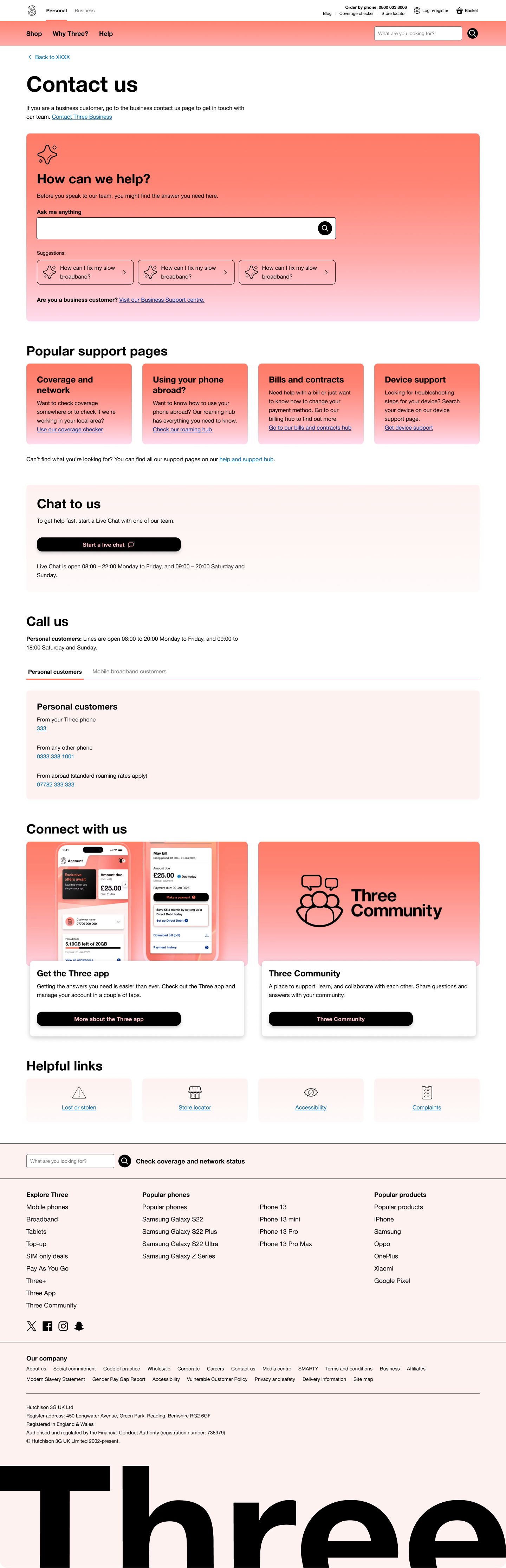
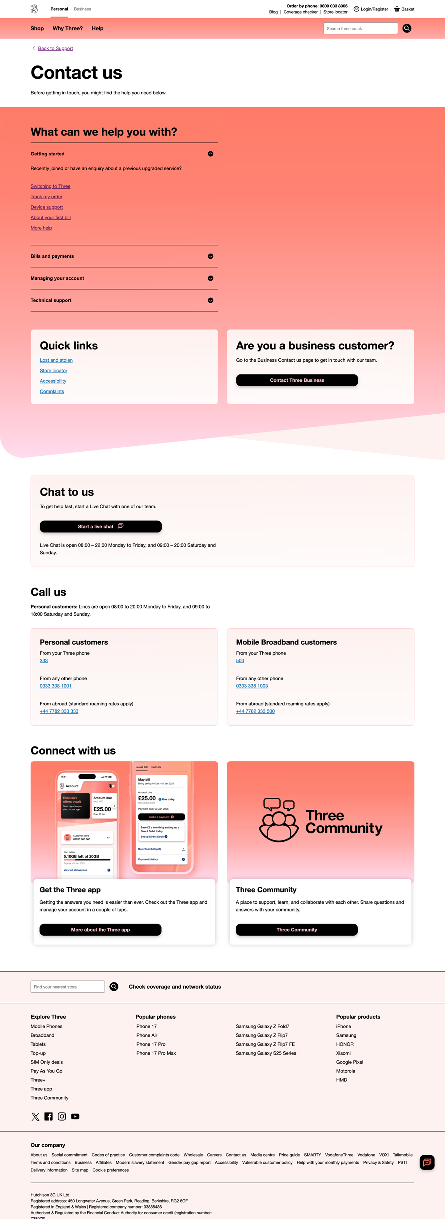
Second iteration added the AI component and brushed the designed that went live. Visit Contact Us.
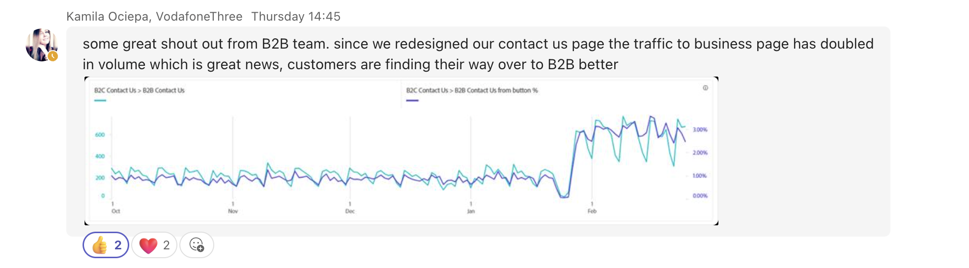
A good review we received from the B2B team that Business customers were finding even easier to access to the B2B contact page after landing on the commercial page.