The Women’s Environmental Network is a feminist charity organisation that supports a greener planet through public awareness. The current website required redevelopment as has been out-of-date for a number of years and since then its format has not been updated. Content kept piling up, in a matter that it had to be organised.
Project:
UX Design| UX Content Design
Tools Used:
Sketch| Invision app
Challenge:
The challenge was to bring the main objectives of the organisation to light and also to conduct an independent research to get foot with a valid USP (Unique Selling Proposition) that can stand out from other charities and NGOs.
Business Goals and Objectives:
1) Increasing donation contributions from members and the general public.
2) Organising content into a more modern sort and establishing a valid product USP.
3) Building a degree of engagement with the user through blogging, social media and event awareness.
Click HERE to view the Project's Case Study.
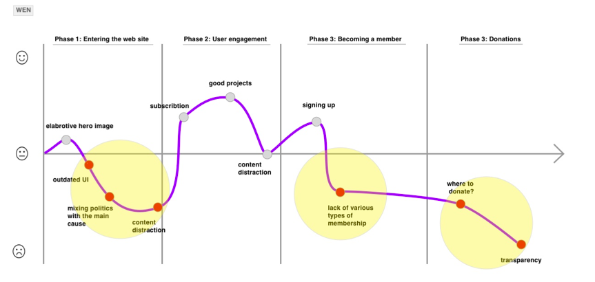
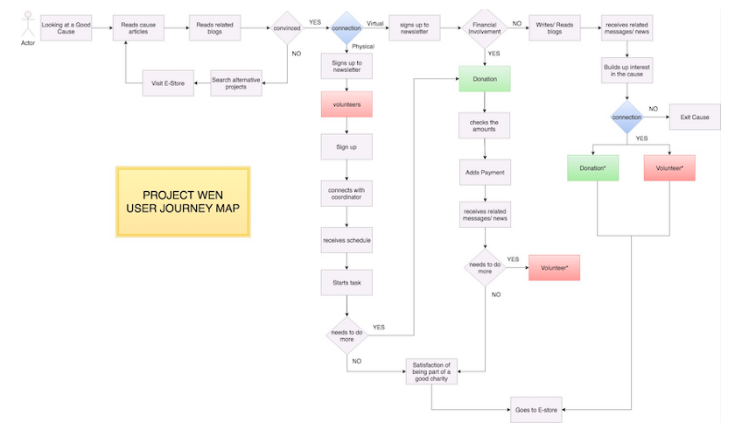
User Journey diagram with expressed Pain Points
A Customer Experience map visually identifies and organizes every encounter a customer has (or could have) with your company and brand.
Visualising the findings from user research phase to define motivations and pain points whilst progressing user centred process. This technique also incorporates empathy mapping which the user encounters throughout the experience.
Refer to the Case Study for the more detailed Qualitative Research Analysis (Click)
** One of the key research findings through the User Mapping Diagram and Research was the urgent need to organise the content of the web site.
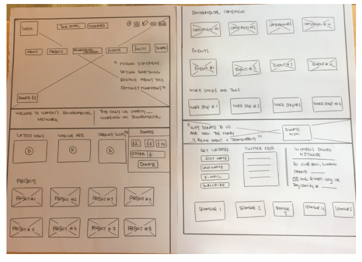
Homepage Hand Sketches
Low fidelity Usability testing:
When designing we organized the content into boxes, each with a label. In our design, initially the idea was to open each box content in a micro pop-up. The same was with the blogging feature.
The main hypothesis was to ask the test subject to examine the site’s USP and be able to donate to a specific project.
Remarks:
- We conducted a number of three (3) tests; all did well. However they disliked the content box pop up feature and would rather a sliding secondary box from the original once. We thought it is a good idea, since the site would be developed using Java Script, with several JQUERY features, an extra addition would seem nice.
- The same issue occurred with the blog button, we had to change the opening feature from pop up to new page.
** design was to use the iteration notes from the previous usability test and to improve our medium level fidelity design wireframes.
Screen video of the original web app before the recommended modifications.
A quick presentation of the Medium Fidelity art boards for the Women’s Environmental Network website. After remarks from the Usability test were taken into consideration, my design emphasised on interaction UX design and content organisation.